
全国中心


 AI智能应用开发
 AI大模型开发
 AI鸿蒙开发
 AI嵌入式+
 AI大数据开发
 AI运维
AI运维 AI测试
AI测试 跨境电商运营
 AI设计
AI设计 AI视频创作运营
免费领取黑马程序员AI通道专属星级课程资料

更新时间:2018-11-16 来源:黑马程序员技术社区 浏览量:
TypeScript 入门,写一个 react 进度条组件写在最前面如果你写过 react 的组件, 这篇文章对与你来说基本没有什么难度。纯粹的是加上了一点 ts 的知识。我完全是以学习者的姿态来描述我写组件的过程,很多不严谨的地方请大家指出来哈哈。
看看实现的效果-gif 动图效果 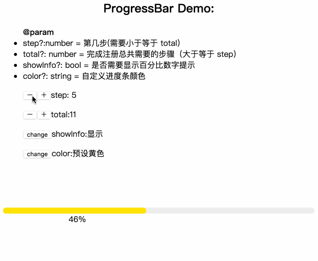
这是一个普通的 UI 组件,难点主要在设计(css)上面。
需求:分步骤进行的一个精度条,我们只需要输入参数,step 和 total 来计算出百分比然后显示就 ok 了。
/** @param step 第几步* @param total 总共的步骤* @param showInfo 是否需要显示百分比提示* @param color 可以自定义颜色*/复制代码说了这么多开始动手吧环境配置方面就略过了,这里我们直接来写代码
需要配置 node,ts,less 环境
1、在你的 componments 文件下创建一个 progressBar 文件夹。tsx 是 react下特殊 ts 文件。 然后在 progressBar 下面继续添加 index.tsx 和 style.less
-- componments -- progressBar -- index.tsx -- style.less复制代码index.tsx2、先引进必须的组件
import React, { Component } from 'react';import * as PropTypes from 'prop-types';import './style.less';// 定义接口 export interface IProgressProps{ }// 定义类class ProgressBar extends Component<IProgressProps> {}export default ProgressBar;复制代码要点: IProgressProps ,使用 pascal 命名,用 I打头,Props 是代表这个接口参数支持。
3、根据我们上面需求的分析,我们来定义 interface,定义类的 propTypes 和 defalutProps
export interface IProgressProps { // prefixCls 为了以后样式统一设置的 classname prefixCls?: string; step?: number; total?: number; showInfo?: boolean; color?: string;}class ProgressBar extends Component<IProgressProps> { //设置默认值 static defaultProps = { prefixCls: 'demo-progress', step: 2, total: 10, showInfo: false, color: '#FFE103' }; //设置类的参数类型 static propTypes = { prefixCls:PropTypes.string, step: PropTypes.number, total: PropTypes.number, showInfo: PropTypes.bool, color: PropTypes.string }; render(){ return( <div>progressBar</div> ) }}复制代码要点: 其中的“ ?”表示可选,number 就是接口参数的类型。表示你输入的必须是一个 number 类型,不然 ts 会报错。这里我们可以引用一下 progressBar 模块,看看成功没有。如果现实了 progressBar 的话就表示成功了。
4、处理进度条 UI 和文字内容,render部分
/** * @desc 处理 progressNumber */const validProgress = (progress: number | undefined) => { //当你的参数定义了 number 等类型,你必须对 !progress 的时候处理,不然 ts 会提示你错误。 if (!progress || progress < 0) { return 0; } else if (progress > 100) { return 100; } return progress;};/** * @desc 除法处理成0-100的整数 * @param step * @param total */const percentDeal = (step: number | undefined, total: number | undefined) => { if (!step || !total) { return 0; } return (step / total) * 100;};/** * @param text 百分比显示 */const parseIntPrecent = (text: number): string => `${Math.ceil(text)}%`;class ProgressBar extends Component<IProgressProps> { /* ... ....defaultProps .....propTypes ...... */ render(){ // 把需要的值先从 this.props 中取出来 // restProps 扩充参数用 const { prefixCls, step, total, showInfo, color, ...restProps } = this.props; /** * percent 百分比 * text tip 显示文字 * progressInfo 提示模块 * porgress 主模块 */ let percent; let text; let progressInfo; let progress; //处理百分比显示内容 percent = percentDeal(step, total); text = parseIntPrecent(validProgress(percent)); // 如果 true 的话,我们使用创建一个 showInfo 模块 if (showInfo) { progressInfo = ( <div className={`${prefixCls}-show-info`}> <span className={`${prefixCls}-text`}>{text}</span> </div> ); } //创建一个主模块用做进度条 //prefixCls 这里统一了命名 progress = ( <div> <div className={`${prefixCls}-outer`}> <div className={`${prefixCls}-inner`}> <div className={`${prefixCls}-bg`}> {progressInfo || null} </div> </div> </div> </div> ); return ( <div {...restProps} className={`${prefixCls}`}> {progress} </div> ); }}复制代码要点:把处理数据的函数定义在 class 外部,不要在 render 中处理数据。 进度条的实现很多种,这里就是普通的三层,文字,背景,进度条,和外层。
style.less5、根据上面的 gif 设计图来实现一下样式
.tiger-progress { &-outer { width: 100%; display: inline-block; margin-top:30px; margin-right: 0; padding-right: 0; } &-inner { vertical-align: middle; display: inline-block; background: #eeeeee; border-radius: 100px; position: relative; width: 100%; }//预留 &-bg 背景颜色代表进度条的长度,灰色的 inner 背景 &-line { width: 100%; font-size: inherit; position: relative; } &-text { word-break: normal; width: 2em; text-align: left; font-size: 1em; margin-left: 8px; vertical-align: middle; display: inline-block; white-space: nowrap; line-height: 1; }}复制代码要点:// &-bg 颜色代表进度条的长度,灰色的 &-inner 背景作为总的长度。
补充 render 内的代码, 根据输入的 step 和 total 计算出来的数据来设置一下进度条的长度。
const { prefixCls, step, total, showInfo, color, ...restProps } = this.props; /** * percent 百分比 * text tip 显示文字 * progressInfo 提示模块 * porgress 主模块 */let percent;let text;let progressInfo;let progress;percent = percentDeal(step, total);console..log("percent",percent)// percent: 20text = parseIntPrecent(validProgress(percent));console.log('text',text)// text: 20%if (showInfo) { progressInfo = ( <div className={`${prefixCls}-show-info`}> <span className={`${prefixCls}-text`}>{text}</span> </div> );}// color defalutProps 定义默认的颜色// 前面&-bg 设置 relative 定位const fixBgStyle = { width: text, height: "12px", background: color, borderRadius: "100px"};progress = ( <div> <div className={`${prefixCls}-outer`}> <div className={`${prefixCls}-inner`}> <div className={`${prefixCls}-bg`} style={fixBgStyle}> {progressInfo || null} </div> </div> </div> </div>);return ( <div {...restProps} className="tiger-progress"> {progress} </div>);复制代码大功告成是不是很简单,然我们再来看看效果codesandbox.io/s/940nq3531… ,调试一下代码
作者:黑马程序员大数据培训学院
首发:http://web.itheima.com/


.jpg)